
Welcome to part 2 of my ultimate guide to describing charts and graphs! If you missed part one where I talked about vocabulary click here. Part two is all about the tenses you need to use when talking about changes and trends.
- Describing charts in the present time: This area is probably the biggest mistake that English learners make, and it changes the meaning of what you want to say. It is very important to get the tenses right here’
For example, there is a huge difference between these two sentences:
‘Ice cream sales increase‘
‘Ice cream sales are increasing’
The one which you most likely want to use is the second one – ‘Ice cream sales are increasing’
This is because we use the present continuous to talk about things which are happening NOW:

In the chart you can see ice cream sales increasing each month.
If you say the other sentence – ‘Ice cream sales increase‘, it means something VERY DIFFERENT, and it is therefore very important to get this right.
In English, we use the present simple tense to talk about situations which repeat. If you use present simple to describe graphs and charts, for example ‘ice cream sales increase’ it means that the chart repeats. In other words it means that ice cream sales increase, then they go down , then they increase again, then they go down, then they increase again etc.

You need this for sentences like: ‘ice cream sales increase every summer‘. This means that every summer ice cream sales increase, then they go down in the winter, then they increase again in the summer and so on..
‘Ice cream sales are increasing because we are moving towards summer’‘Ice cream sales increase every summer’
It is very important to get these differences right, because it can cause a lot of confusion if you get this incorrect. Here is another example, take a look at these two sentences:
‘Profits increase in the first quarter’
‘Profits are increasing in the first quarter’
The first sentence – ‘profits increase in the first quarter’ – actually means that profits increase EVERY FIRST QUARTER, which doesn’t actually say anything about the situation now.
The second sentence – ‘profits are increasing in the first quarter’ – means that we are in the first quarter and profits are increasing RIGHT NOW. This is the one you are most likely to use.
Here are some more examples:
‘Profits go up every summer during the tourist season’
‘Profits are finally going up because we are in the tourist season’
‘The number of people who work at the company is increasing due to the company’s success’
‘The number of people who work at the company increases every summer, because the work is seasonal’
- Describing charts in the past time
When describing long charts like these, you can just use the past tense to describe what happened:
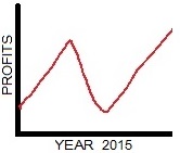
‘Profits rose in the first two months, then they fell in the second quarter before finally picking up again at the end of the year.’
However, when you are describing charts which are continuing to the present time, you should use present perfect continuous to describe the last part. Here is an example to show you what I mean:
Here is a chart which goes to now, April 2019:
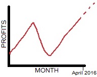
‘Profits increased in January, then they plummeted in February, but in March and April they have been rising’
We use ‘have been + ____ing’ for the last part, because April is not yet finished, and profits may continue to rise.
Here is another example chart. Take a look at how I have used past tense for the first to parts and then present perfect continuous (have been + _______ing) for the last part:
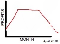
‘Profits soared in January and February, and then they plateaued in March, but since then they have been falling in April’
I used the past tense to talk about the first few months, because they are finished, and for the last part of the graph I used have been + _____ing because that may continue.
Now we have learnt about verb tenses in describing charts and graphs, take a look at how to talk about graphs in a presentation!
If you would like to have any of these words explained further, or if you would like to see some more examples, feel free to email me at [email protected], or message me on Skype at live:fluencyspace! Also if you have any other questions about English I’m happy to answer your emails or I will write a post about it, keep the emails coming! Check out more useful business English grammar right here!

David Cox
Fluency Space
Make the world your fluency space. Business English for career and life success
Did you enjoy this article? Follow me on Linkedin!
[addthis tool=addthis_horizontal_follow_toolbox]
[button_4 border=”rounded” size=”large” color=”darkblue” align=”center” href=”https://fluencyspace.com/ebook/”]No time to improve your English? Check out my ‘5-step plan’ for busy professionals[/button_4]